ArtStar, Born in 2011, Raised in NYC
ArtStar is a New York–based platform for discovering and collecting contemporary art. I refreshed the brand with a new identity—logo, typography, color palette, and messaging—while also leading a full website redesign and Shopify 2.0 migration, introducing custom templates, interactive features, and SEO enhancements.
-
One of the challenges that ArtStar asked me to tackle was educating the audience about the brand’s legitimacy and credibility. ArtStar is not a temporary pop-up platform that sells art prints; it’s a New York-based brand with over a decade of experience in handling limited-edition art. It was essential that the new branding communicated this message.
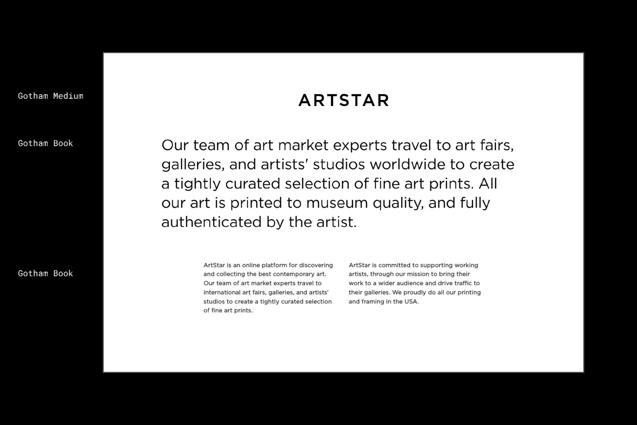
The new logo I designed utilizes Gotham, a geometric sans-serif typeface released by Hoefler & Co. in the 2000s. Known for its aesthetic, versatility, legibility, and cultural significance, Gotham has been widely adopted in the media– Gotham was used for Obama’s election campaign in 2008.
Unlike other sans serif typefaces, Gotham doesn’t draw on European influences– it’s neither German nor French. The typeface itself has very American aspect to it. It also has a touch of masculinity and affirmative qualities, giving the letterform a sense of established credibility, and a compelling voice. For a brand that has been excelling since 2011, Gotham was the one to take the brand to the next level. The letterform was meticulously refined, resulting in a final logo that works seamlessly across both print and digital materials. Gotham was also chosen as the primary brand font, as it conveys different tones depending on its weights and capitalization, which perfectly aligns with ArtStar’s rich and robust visual identity.
The new color palette, inspired by trending art from ArtStar, offers a variety of options. From vibrant and striking hues to more muted, mature tones, each represents the dynamic range of ArtStar’s collection. The colors can be combined in various ways in order to create immerse looks and moods for different audiences. Along with the new color scheme and font, the brand’s key messaging was also restructured, solidifying ArtStar’s core values through its visual elements.
-
Alongside the identity refresh, I developed a new website layout, design system, and wireframes for both the main landing page and product pages, translating the brand’s core messaging and vision into a cohesive visual presence.
In addition to updating the visual elements to reflect the new branding, I conducted a thorough review of the existing UI/UX design of the website. Using LuckyOrange, a website optimization tool featuring heatmaps, session recordings, and form analytics, I identified key areas for improvement and restructuring. The previous landing page was overloaded with information, lacking clear hierarchy and strategy, which hindered seamless user engagement. So, I streamlined the content hierarchy and introduced a more effective way of presenting it– similar to crafting an architectural blueprint. With this in mind, I went through multiple iterations to design modules including navigation, hero banner, product carousel, image card and text modules, testimonial sections, and footer segments.
I also helped ArtStar in transitioning from Shopify 1.0 to Shopify 2.0. ArtStar needed access to Shopify 2.0 features, such as advanced product filtering and flexible display options, which were unavailable in Shopify 1.0. Working closely with the development team, I designed layouts for various custom templates, interactive artwork framing displays, and SEO-friendly features to enhance user engagement, delivering a seamless upgrade that reflected ArtStar’s goals.
-
In the e-commerce world, keeping customers informed from the moment they place an order until it’s delivered is crucial. To achieve this, I created personalized email flows tailored to each user’s behavior using Klaviyo, an automation platform for email and SMS marketing that enables businesses to create personalized customer experiences.
I designed email flows for various stages of the customer journey, including retail (welcome email upon signing up), browse/cart abandonment (reminder for users who explore products but leave the site without taking any further action), trade program (emails for exclusive partnerships), and post-purchase (follow up emails after an order is placed). From start to finish, these flows are intended to improve retention and encourage the next purchase, in which I led every phase of the project.
I began by cleaning up ArtStar’s previous email flows and redefining the system in the back end. When designing the emails, my focus wasn’t just on updating the visual aesthetics to align with the new brand identity but also on strategically optimizing the layout for better user experience and clarity. Once the preliminary design was established, I started building the emails within Klaviyo. It also required strong understanding of web standards, CSS, HTML, and responsive design. After in-depth user testing, the email finally went live.
Each email was customized by using dynamic (variable) content– each recipient receives personalized text, images, and calls to action. For instance, the order confirmation email includes a key information table that changes each time based on the specific order.
I also developed engaging components that kept customers connected with the brand while waiting for delivery, such as insights into how ArtStar handles printing and framing, as well as a step-by-step guide on how to hang art. In the post-purchase flow, ArtStar sends a series of four emails over time, keeping customers informed about their order’s progress.


