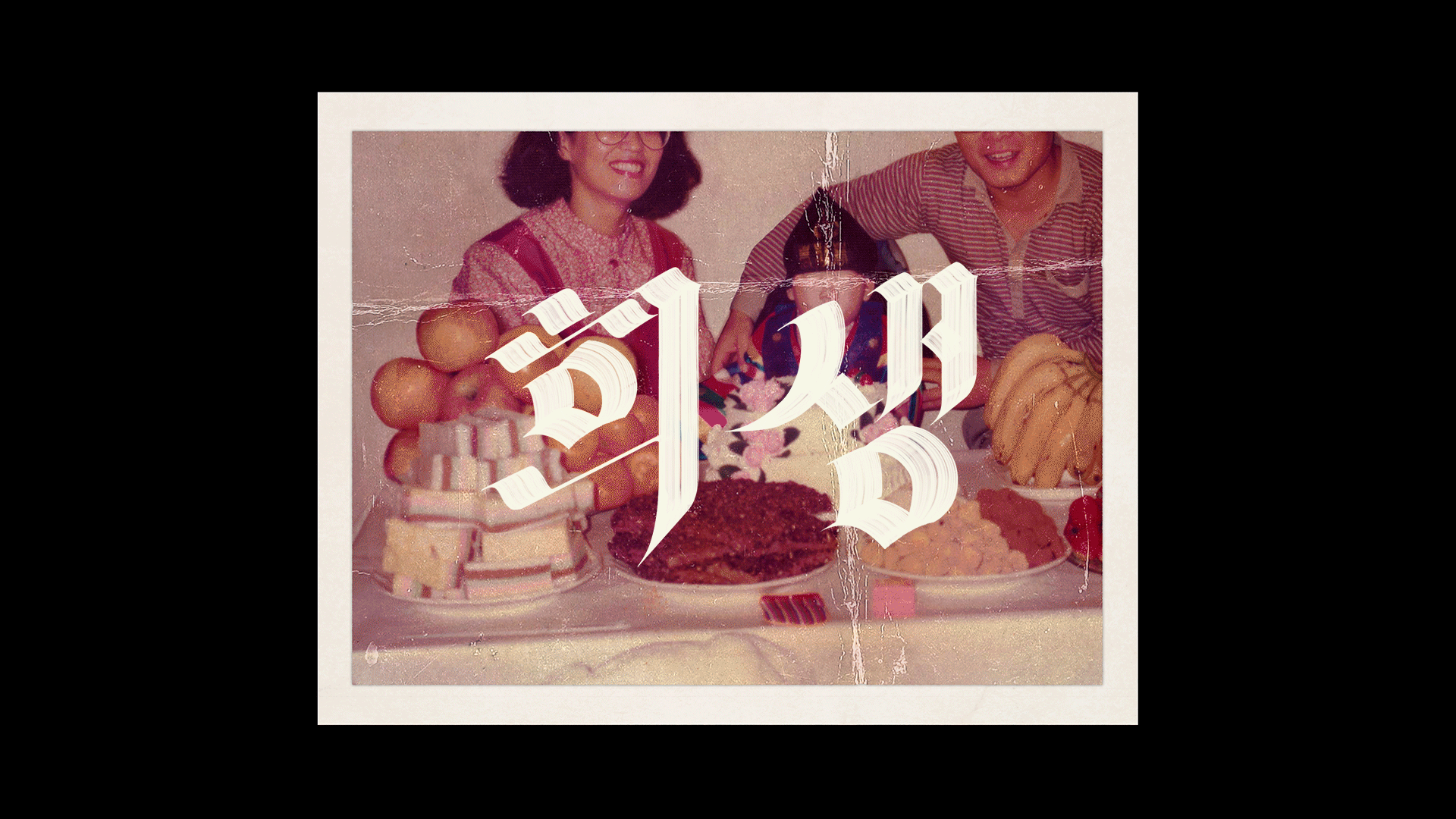
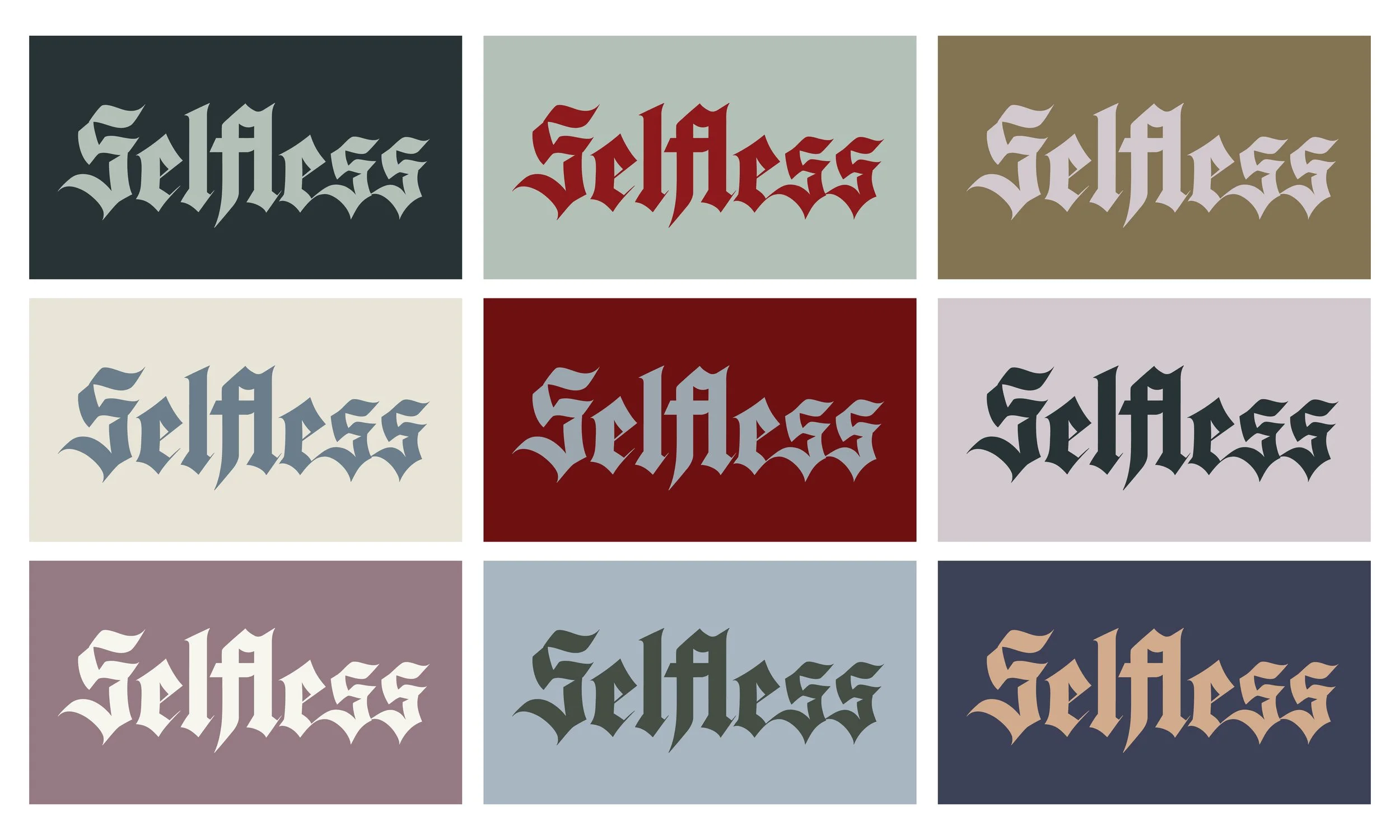
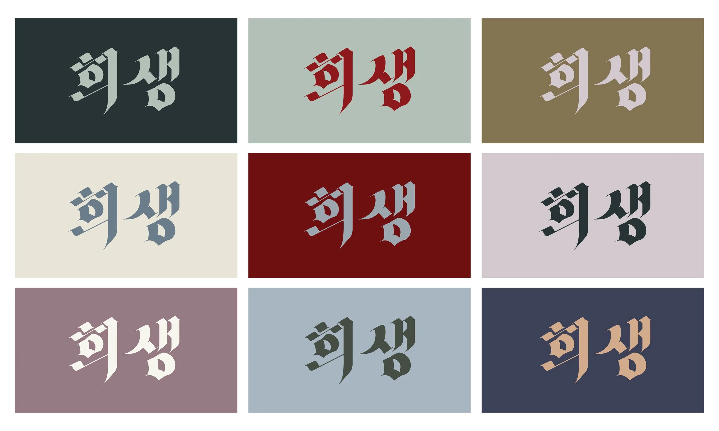
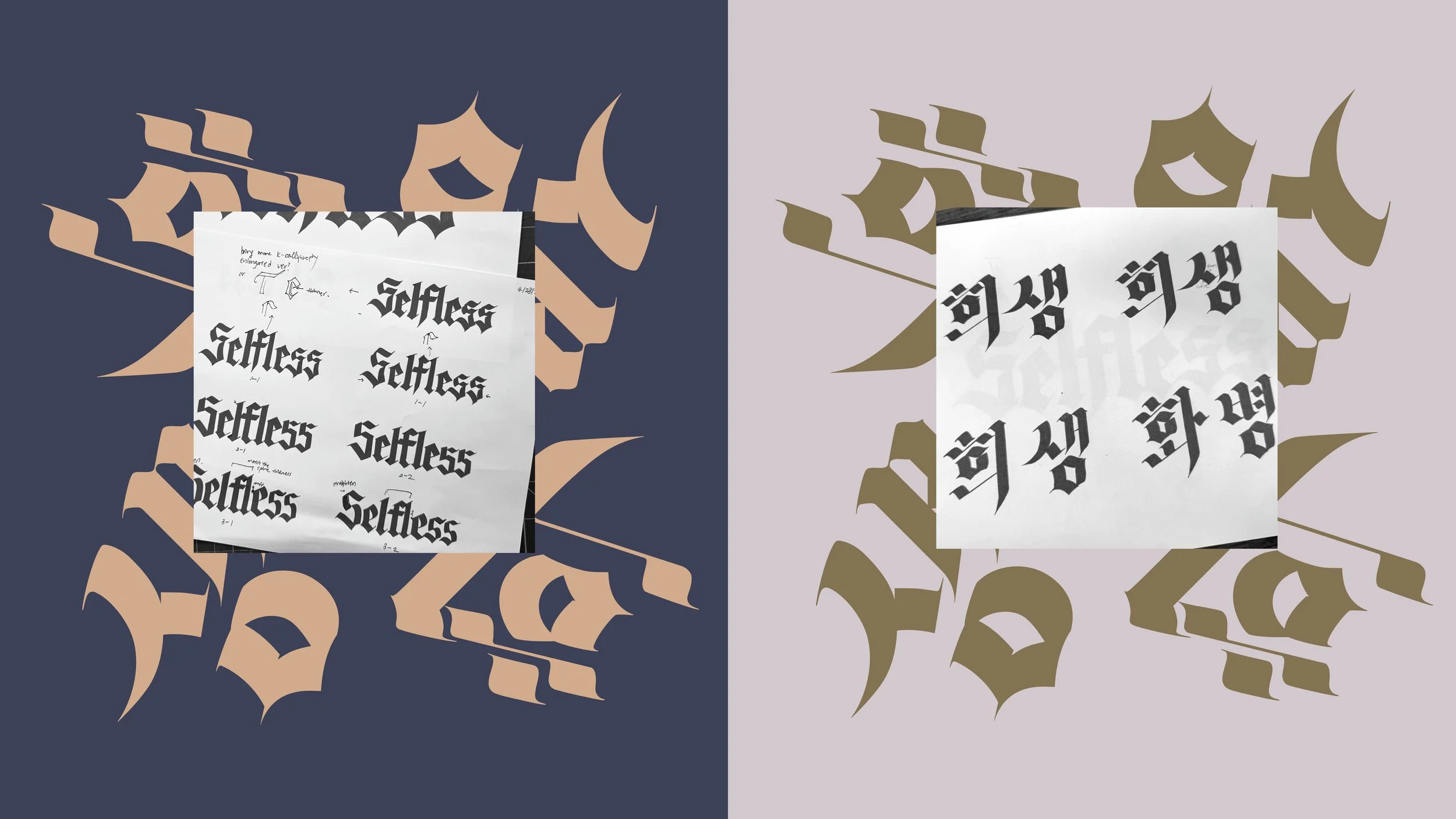
Title Design for Selfless
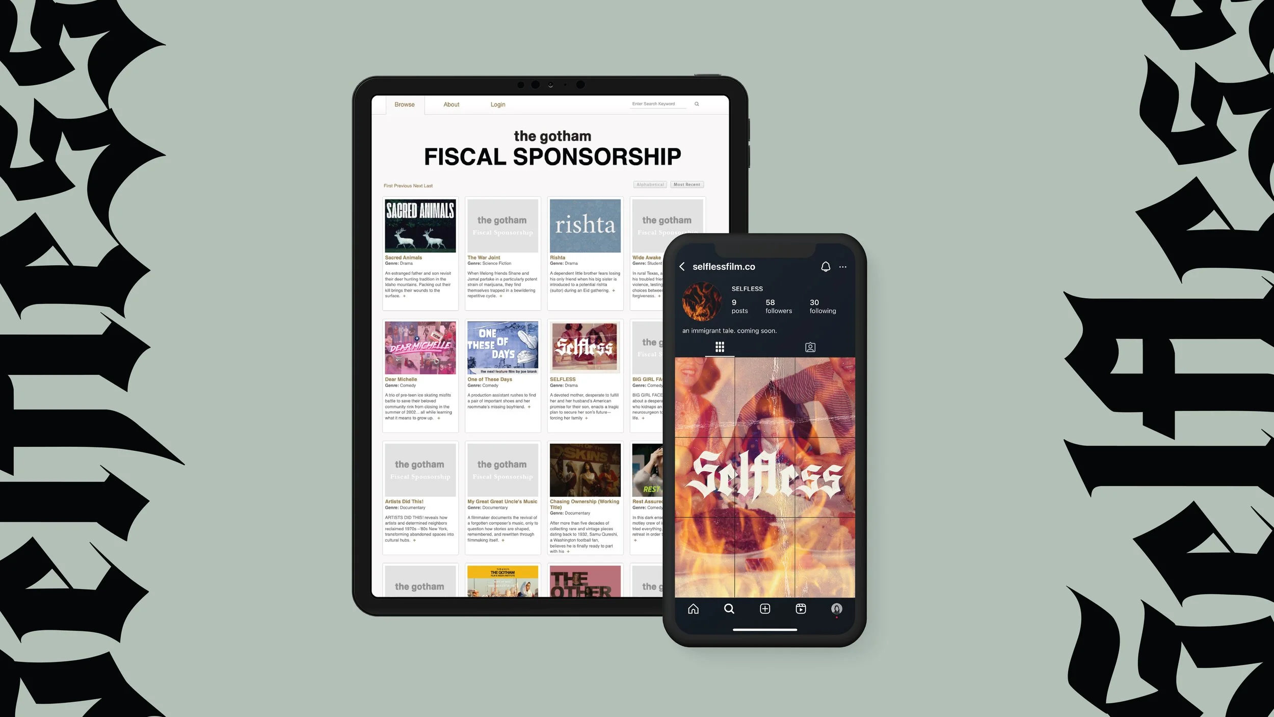
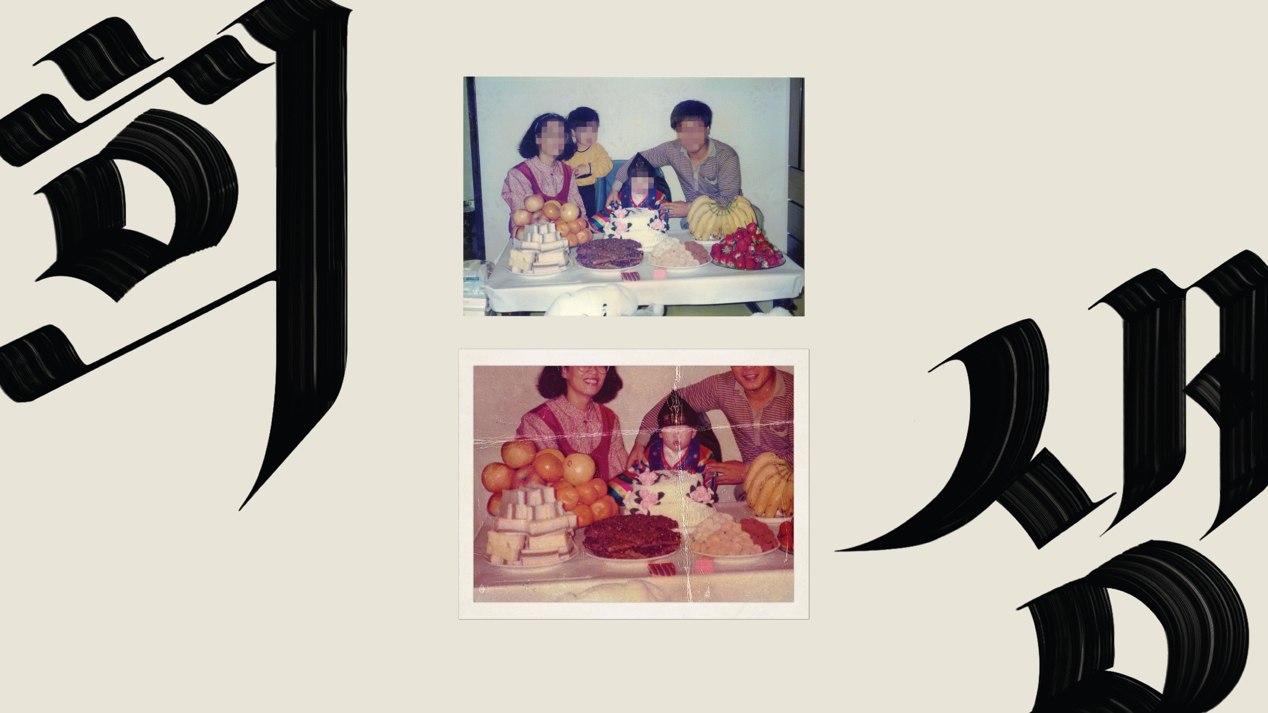
Selfless is a pitch-black short film about ambition, sacrifice, and faith within the context of a Korean American family. A devoted mother, desperate to fulfill the American dream she and her husband envisioned for their son, enacts a tragic plan to secure his future, forcing the family into an explosive confrontation with guilt, sacrifice, and betrayal.
I partnered with House Productions to create the title design (in both English and Korean), primary color palettes, and promotional materials, developing a cohesive visual identity that reflects the film’s darkly comical and ironic narrative.
-
Drawing inspiration from gothic motifs—delusion, isolation, obsession, and madness, as well as refraction and reflection—the titles were custom designed in the textura style. Unlike many blackletter revivals, Selfless’s blackletter emphasizes broad-pen calligraphy to evoke a flame-like atmosphere. Each letterform was modernized and refined to its core, stripped of excessive decorative elements.
Since Korean blackletter does not exist, I meticulously developed Korean letterforms with matching serifs to align with the English title design for visual continuity. The title comes in two styles: the primary version features a hand-painted texture to evoke a gruesome, incendiary, and smoldering aesthetic, while a vectorized version with clean, uniform shapes supports broader applications.
The key image, using an actual photograph of the director’s family of four, was carefully edited and modified, communicating the character arc of the film in a succinct, simple, yet visually striking way. arrestingly. The color palette, inspired by this hero image, exists within the same universe as the film, evoking a dreadful sense of tension. It feels ominous, offbeat, and brooding—inviting the audience to feel and fully experience the world of Selfless.