work by sydney
 

Verge Hotel, capturing the dynamic color schemes of Havana…

Verge is a passion project for a hotel business in Havana, Cuba, introducing the converging worlds of Havana’s preserved charms with a contemporary take. The core of Verge’s identity is rooted in RISO which complements the city's powerful color palettes.

  • "Verge" is a passion project for a hotel business in Havana, Cuba, introducing the converging worlds of Havana’s preserved charms with a contemporary take. Havana is a unique place where time has been frozen since closing it’s door in the 1950’s. Instead of mass-produced digital billboards and ads, the city is filled with hand-drawn lettering, colorful vintage cars, and textured walls. Verge Hotel aims to provide a one-of-a-kind experience that captures the city’s vibrant color palettes and restores dynamic Cuban culture and architectural legacy.

  • Traditional analog printing meets modern digital screen printing through Riso. The core of Verge’s identity is rooted in print, specifically Risograph printmaking. The bold and eye-catching RISO inks complement the city's powerful color palettes. Though RISO colors are limited, the inks are translucent and can be overprinted to make new colors and depth, which is aligned with the compounding stories of what Verge aims to create. Also, RISO’s imperfect, inconsistent, and analog printing process produces fun quirks and beautiful visual accidents.

  • Typeface
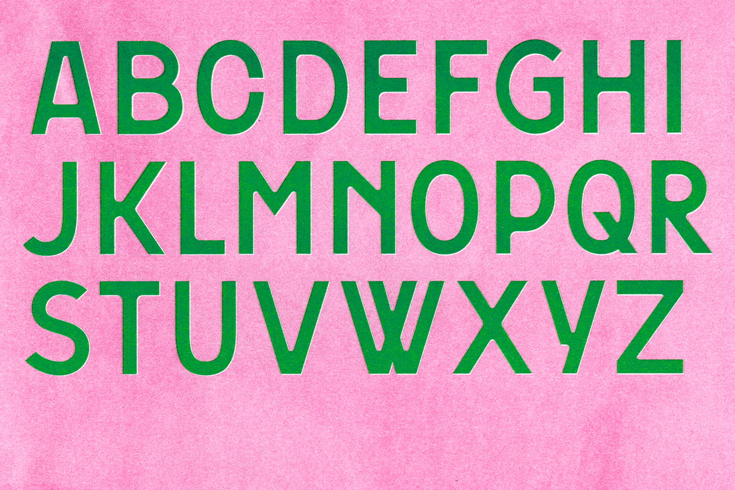
    I created “Verge Sans”, which was used for the logo. It is a semi-codensed letterform that brings moderness and vintage craftsmanship together. Inner round counters, just like the inkbleed of printed typeface, evoke a retro look and feel, while the sharp outer edges represent a modern approach. The slightly angled letterform was inspired by 1940s - 1950s custom letters, adding a touch of “dated” atmosphere. 

    Logo
    Logo can be used as an expressive design element. “Verge Hotel”, divided by this slanted angle, opens up, transforming into a sort of “picture frame” for the central image, which signifies the concept of “unlocking” Havana’s time capsule. 

    Self Mailer Envelope
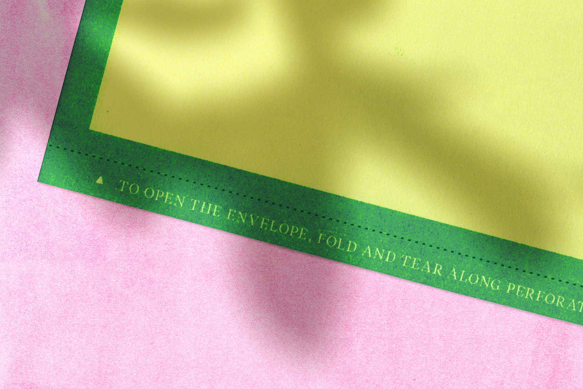
    As for stationary, a self-mailer-style envelope was crafted. It is cost-effective and suits Cuba’s limited resource circumstances. The backside has space for the recipient’s address and stamp, while the front has a fold for opening the envelope. The fully unfolded page retains the brand’s iconic angle. It also comes with a RISO printed postcard inside.


Category

Brand Identity, Print


Recognition

Winner, Communication Arts – 65th Design Annual 2024


Typeface

Verge Sans – Self generated
Tiempos


Credits

Images 1 2 3 4 5 6 7 8


↑ Click arrows to view more slides